

The mobile app was losing trust: app ratings around 1.6–1.7★, slow 5–7s interactions, 15–20% failed transfers, and ~25% retention. Support was swamped; UI and processes differed across 16 countries, and there were no analytics to steer decisions. Organizationally, there was no design governance, unclear ownership, and slow release cycles.
Instrumented analytics (Firebase/Mixpanel + Smartlook/Hotjar), ran interviews, and mapped jobs/flows to surface the biggest losses. Baseline showed 65% bounce on key screens and 60% drop-off at confirmation. A “rebuild vs. patch” workshop with stakeholders led to a full redesign anchored by a unified design system.
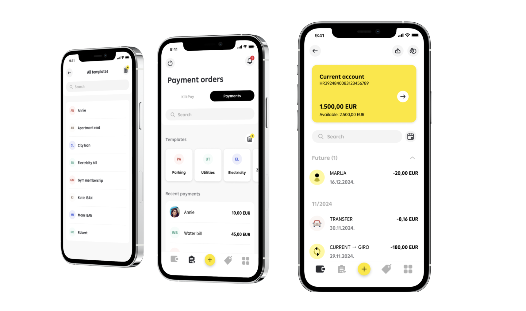
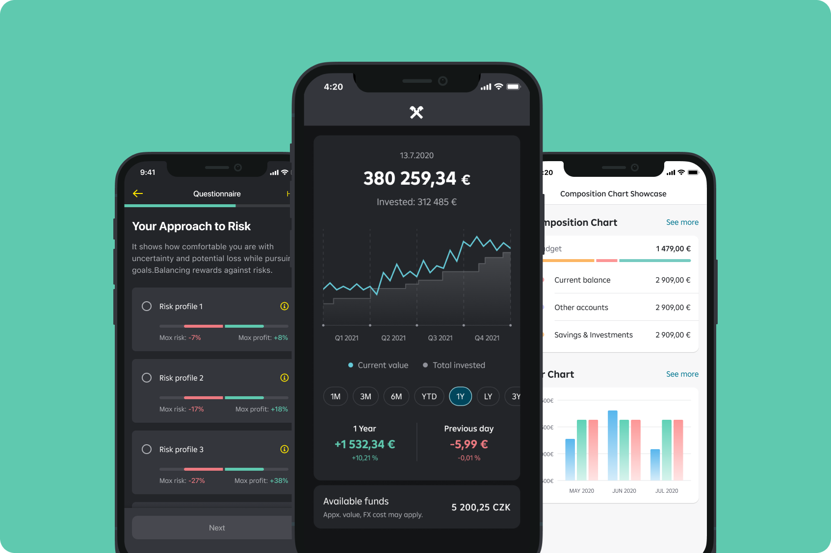
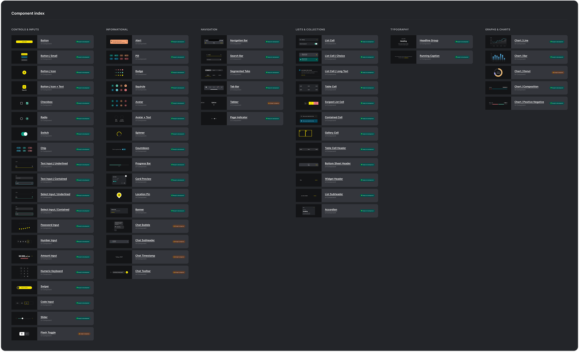
Built a bank-grade component library (WCAG ready, dark mode, motion guidelines). Legal approved a new tone of voice. Localized for 8 languages. Ran microcopy A/B tests that delivered a +25% funnel lift on critical steps. Standardized state design and safe defaults for high-risk flows.
Stood up the initial team in 5 weeks. Introduced OKRs (e.g., rating ≥4.5★, NPS ≥60), bi-weekly sprints, monthly reporting, and cross-functional reviews with Product, Engineering, Compliance, and Support. Launched in-app NPS/CSAT and real-time dashboards within 48 hours of go-live.
An early, more playful visual direction under-performed in tests (“not bank-grade”). The team pivoted to a trust-first visual and content system without sacrificing clarity or speed.
Core KPIs: step-level drop-off, task success, time-to-complete, support tickets per 1k users, App Store rating, NPS/CSAT, and monthly mobile transaction volume.
This project was a live-fire exercise in turning regulation into design, not bureaucracy.
Compliance came in with non-negotiables: PSD2, SCA, KYC, audit trails. Users came in with zero patience for “mystery steps” and failed payments. The tldr version of this story is “we simplified the flows.” The real story is that we kept almost every step and completely rewired how those steps felt.
The team used the ugly baseline numbers (65% bounce, 60% confirmation drop-off) as a forcing function. Every extra field, every second of loading, every line of legalese had to earn its place. Where we couldn’t remove friction, we made it explicit: clear states, plain language, and A/B-tested copy that moved funnels by ~25% without touching the legal requirements.
This only worked because all the right people stayed in the room. Product kept scope sane, Engineering shipped incrementally, Compliance and Legal vetted tone in eight languages, Support called out the errors that actually triggered calls, and Analytics proved that going from ~1.8★ to ~4.8★ and €300M+ mobile volume wasn’t a coincidence.


AI-Based Prediction Market
AI Product Development and Design